
What I have learned so far...
How to work with a diverse set of internal stakeholders to create effective solutions that meet user needs and fulfill business objectives.
About the Company
Rocky Moutain University (RMU) is a graduate university specializing in health professions.
Problem/Solution
There were many problems with the website. It is inconsistent, there are multiple navigation methods with redundancy, drop down menus are too long, pages are too long with a lot of information for users to digest and the website has a high bounce rate. Moreover, the university has low UX maturity. So I need to evangelize and develop some research methods that have never existed. I am redesigning the university website (1,000+ pages) and all supporting websites (4 other websites). To do this I collaborate with my team and the internal marketing/communication teams.
Roles & Team
My Role: UX Designer
Director of Web & Operations/Programer
Web Content Technician/Programmer
Also collaborate with: Directors of Marketing & Digital Media & University Communication
Tools
Figma (Design), Zoom, Microsoft Suite, Adobe Suite
University Website (Original)
Overview
The website had 3 different navigation structures. (e.g., Fig. 1, 2, 3,4). This created a lot of redundancy for users and confusion on where to go on the website. In fact, the side menu seemed as though it did not belong on the desktop version but on a tablet or mobile version of the website.
Content Inventory & Audit
To understand the depth and breadth of the university website I viewed and analyzed over 300 pages. I took notes of not only where all the pages lived but what could be improved in the redesign. I found no consistency from section to section, in fact there were entirely different styles throughout, to many navigation methods (3 in total), information was not organized nor easy to find, users were forced to scroll long pages to find what they needed, too many buttons.
Contextual Inquiry
I job shadowed advisors during their advising sessions with prospective students to understand what types of questions they would ask about the programs in general but also about the website.
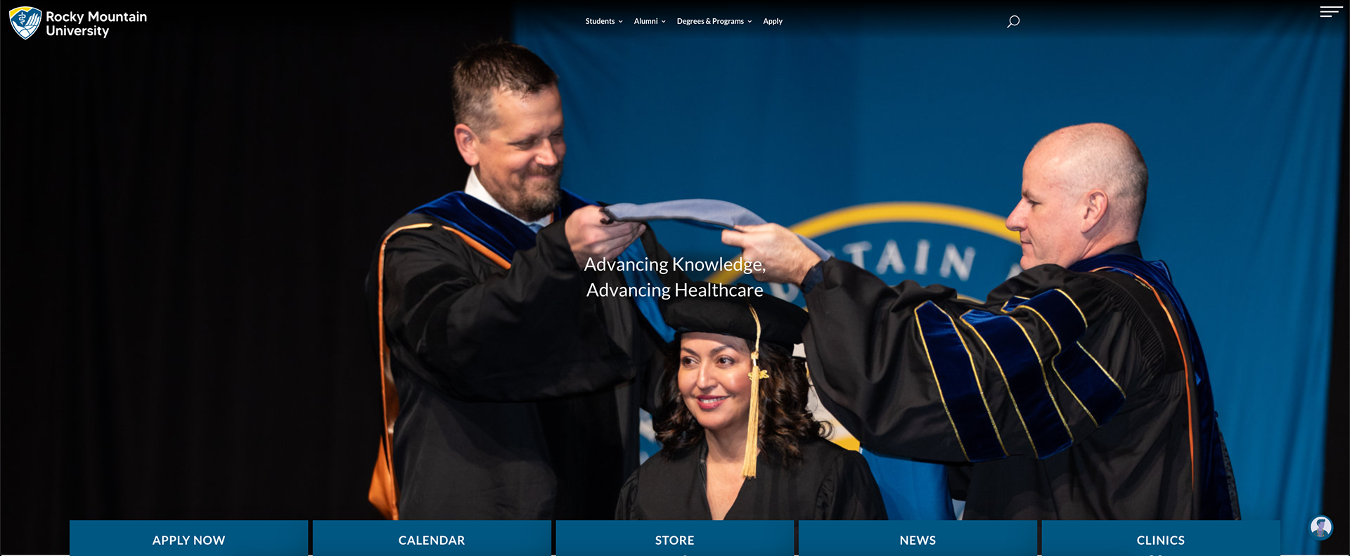
Fig. 1: Top Navigation (Desktop)
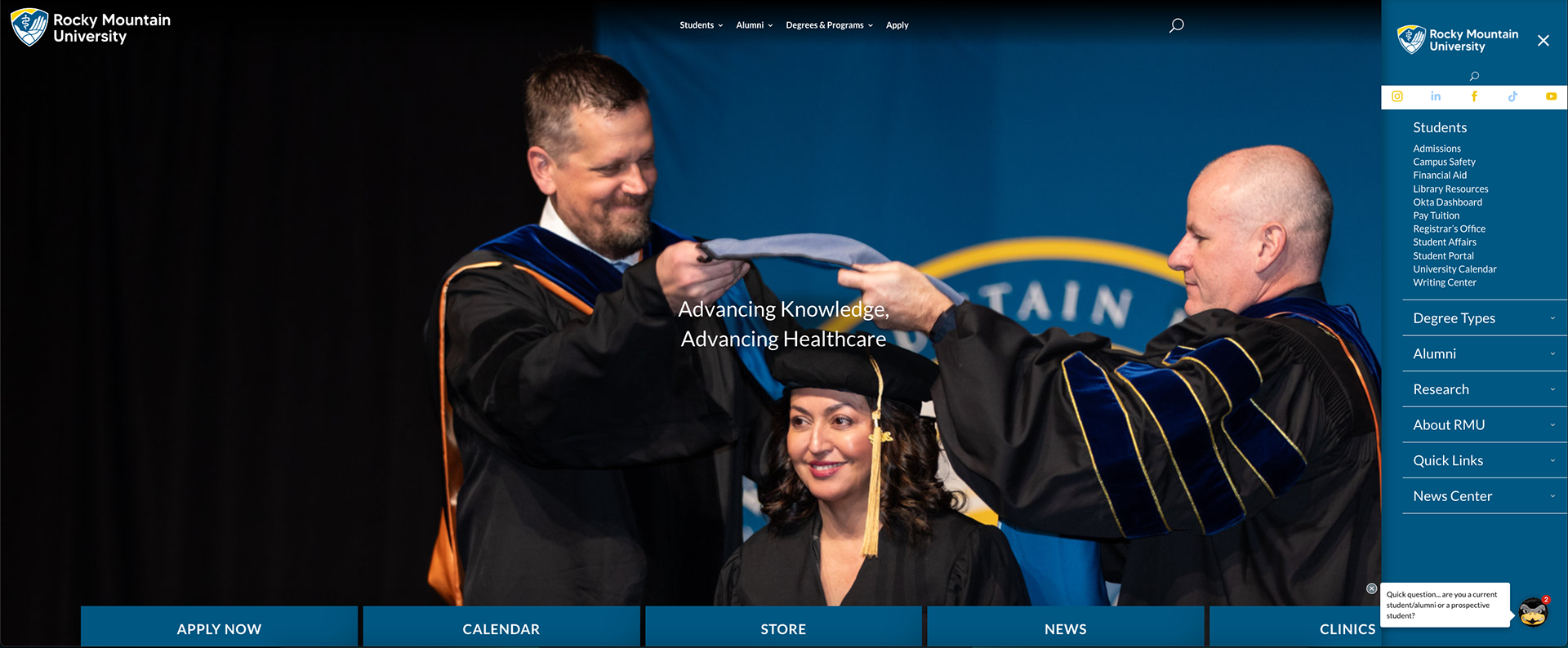
Fig. 2: Right side Navigation (Desktop)
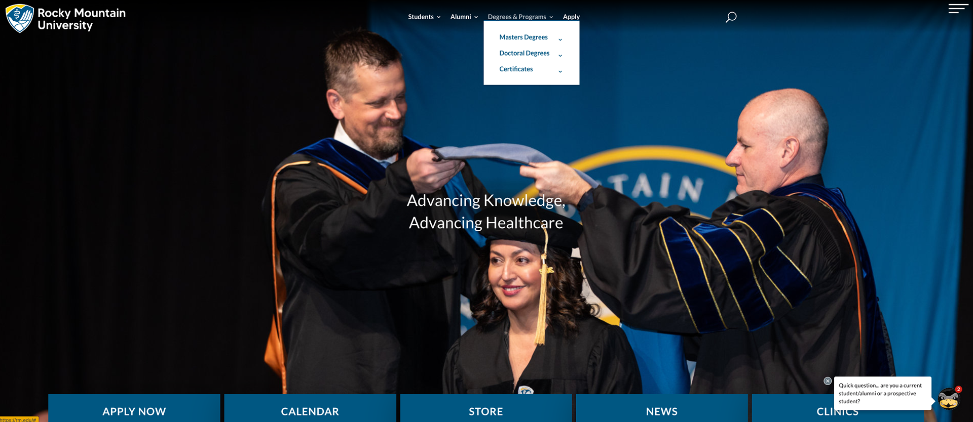
Fig. 3: Middle buttons with top navigation and drop down menu (Desktop)
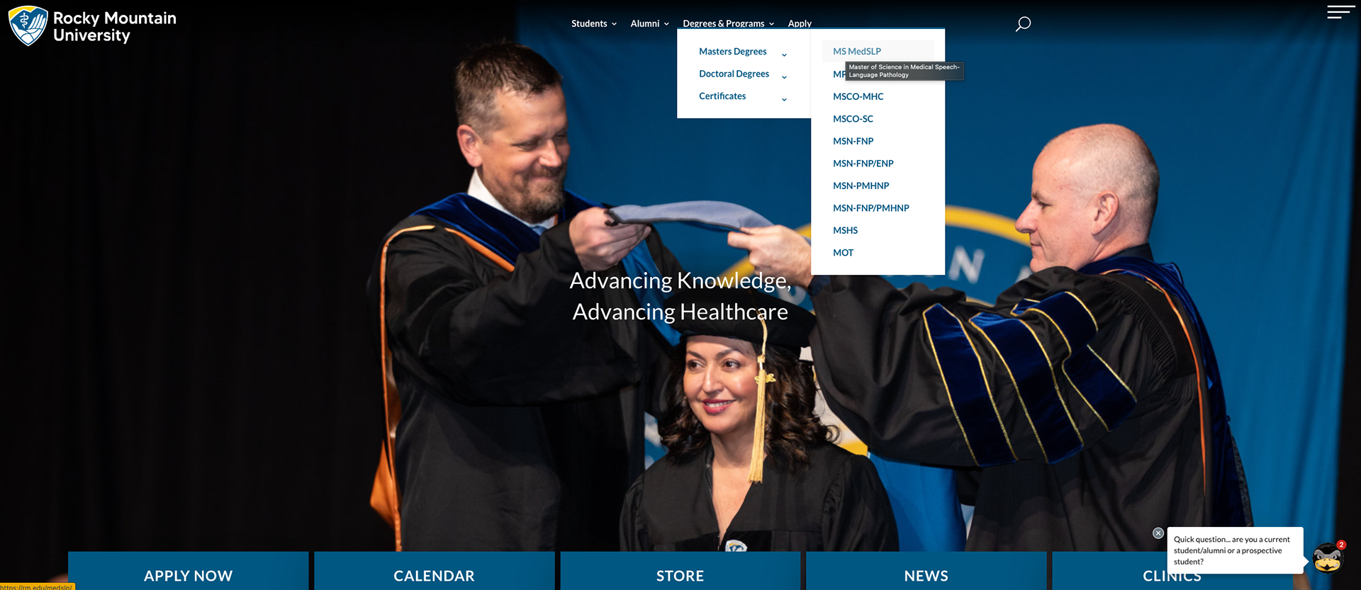
Fig. 4: Middle buttons with top navigation and drop down menus (Desktop)
Leadership proposed taking the acronyms that they were using and spell out each degree, taking an already long drop down menu and making it longer. As you can see in the examples below (Fig. 5, 6) this would make the experience worse. I presented to leadership (using a slide deck) this issue and methodically demonstrated why this tactic would not help an already bad experience. Furthermore, this proposal violated two universal design principles; Fitts' Law (Fig. 7) and the Steering Law (Fig. 8).
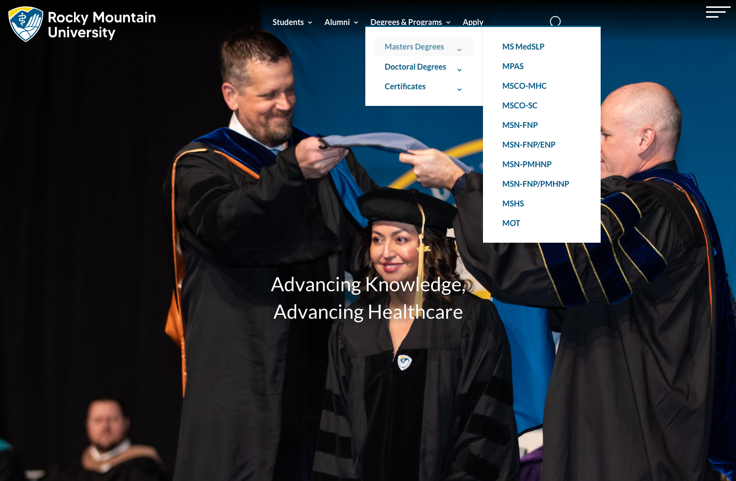
Fig. 5: Drop down menu with acronyms (Desktop)
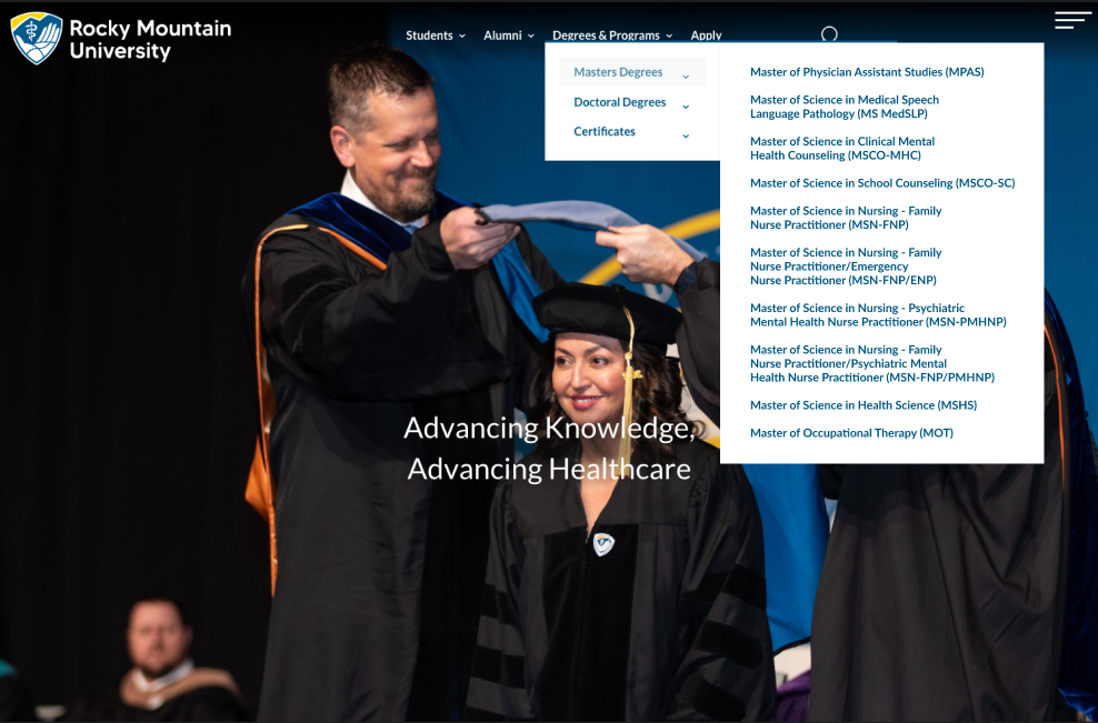
Fig. 6: Drop down menu without acronyms (Desktop)
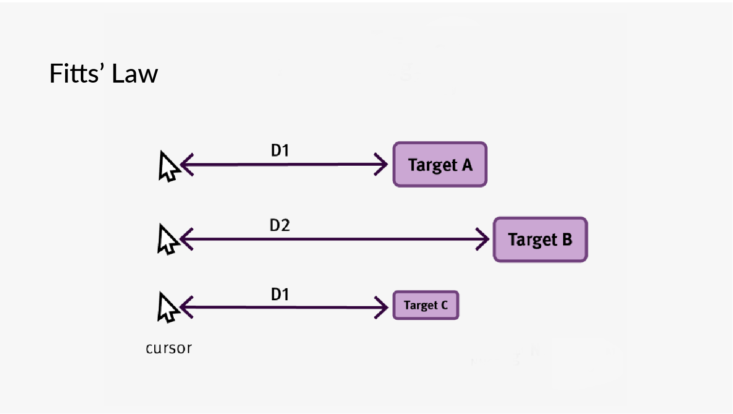
Fig. 7: Fitt's Law example
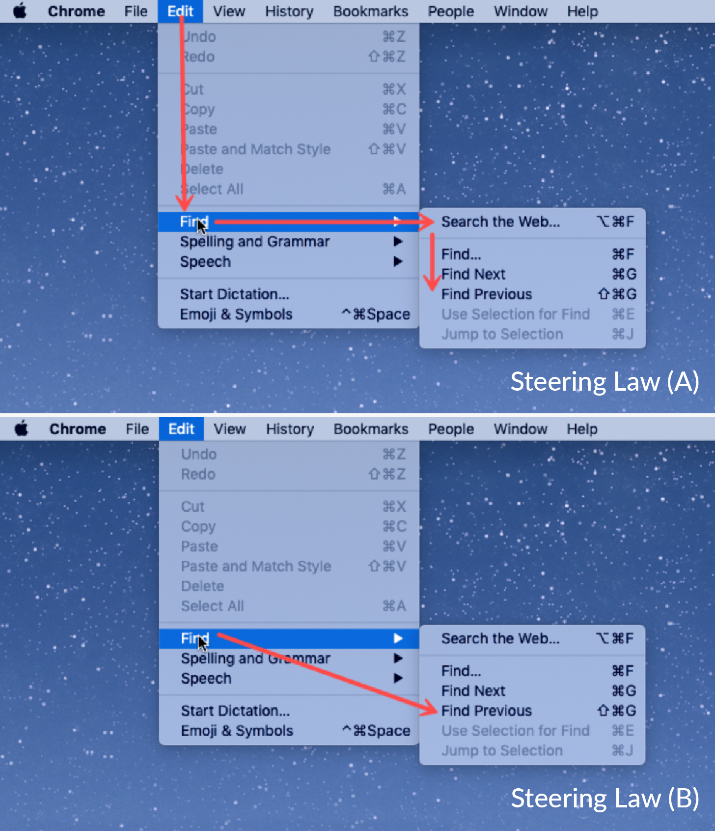
Fig. 8: Steering Law examples
The footer (Fig. 9, 10) shows a list of links that are in no particular order and leave the user with an overwhelming array of choices. Moreover, the university logo (Fig. 10) is in an atypical spot as seen on the right.
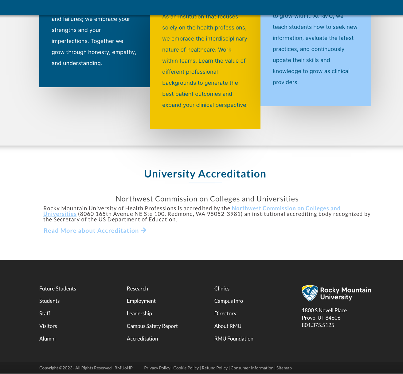
Fig. 9: Footer (Desktop)
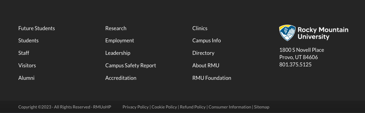
Fig. 10: Footer Detail (Desktop)
The layouts for some of the same content is also inconsistent. As you can see below (Fig. 11, 12) their program pages have entirely different looks creating an uneven experience for users.
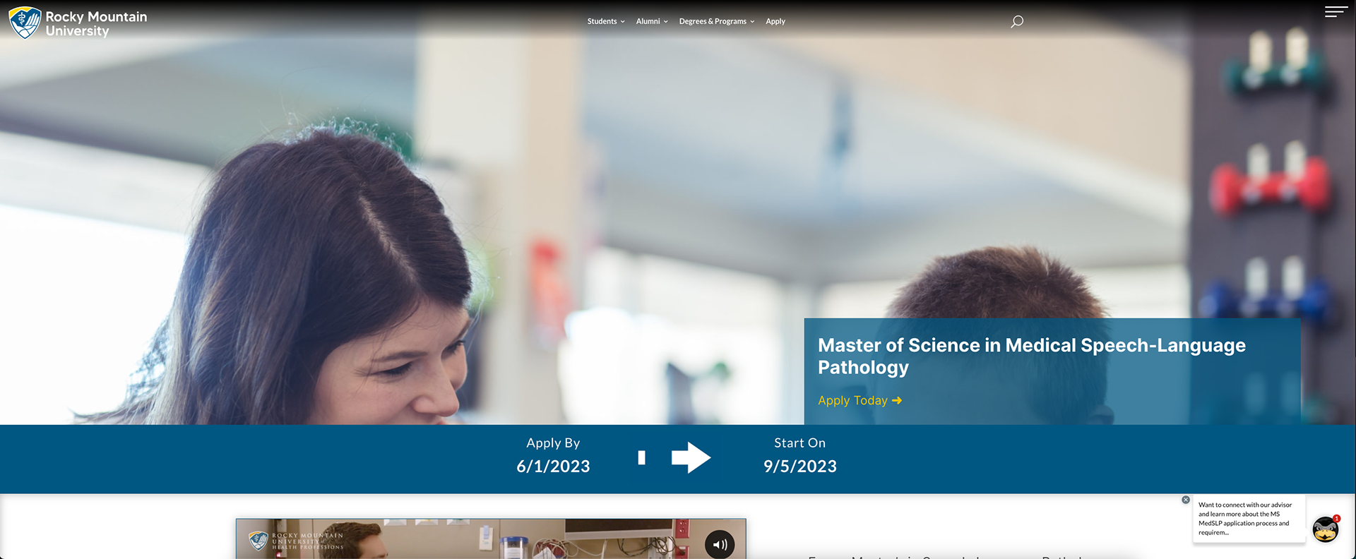
Fig. 11: Layout A-Program pages detail (Desktop)
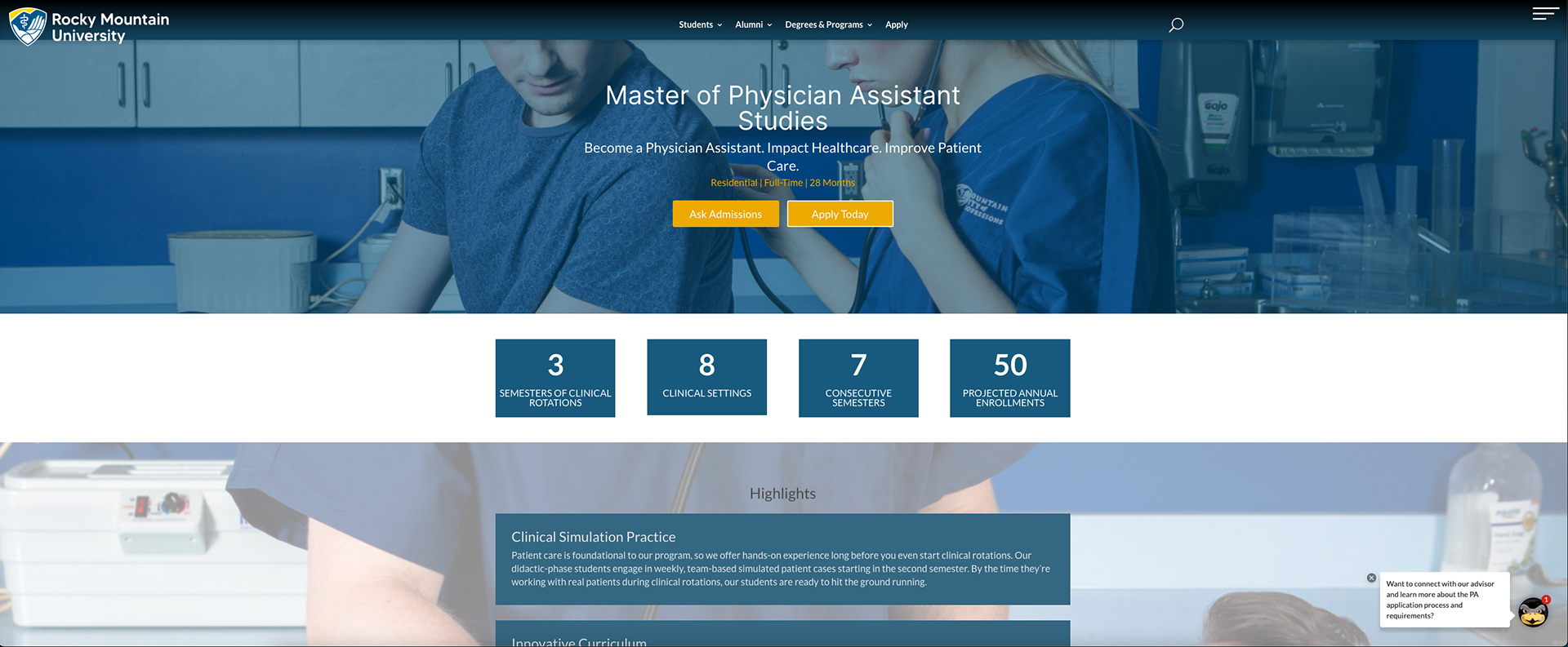
Fig. 12: Layout B-Program pages detail (Desktop)
University Website (MVP)
In the first version/redesign of the website I started by overhauling the navigation structure. In my new designs I removed the right side navigation that seemed out of place on a desktop and replaced the limited top navigation with a more user and growth friendly mega menu. As you can see (Fig. 13) the problems that plagued the top navigation in the previous version will not be problem here. In addition, all links in the menu are now organized into categories to ease the use for a user to complete their task. In Fig. 14 for the academic program pages which in the previous version of the website involved a lot of scrolling for the user to find their information we now have a vertical side menu. This new capability allows the user to see the information in "chunks" which allows them to find and digest the information they want to see without adding to their cognitive load.

Fig. 13: Mega menu top navigation (Desktop)
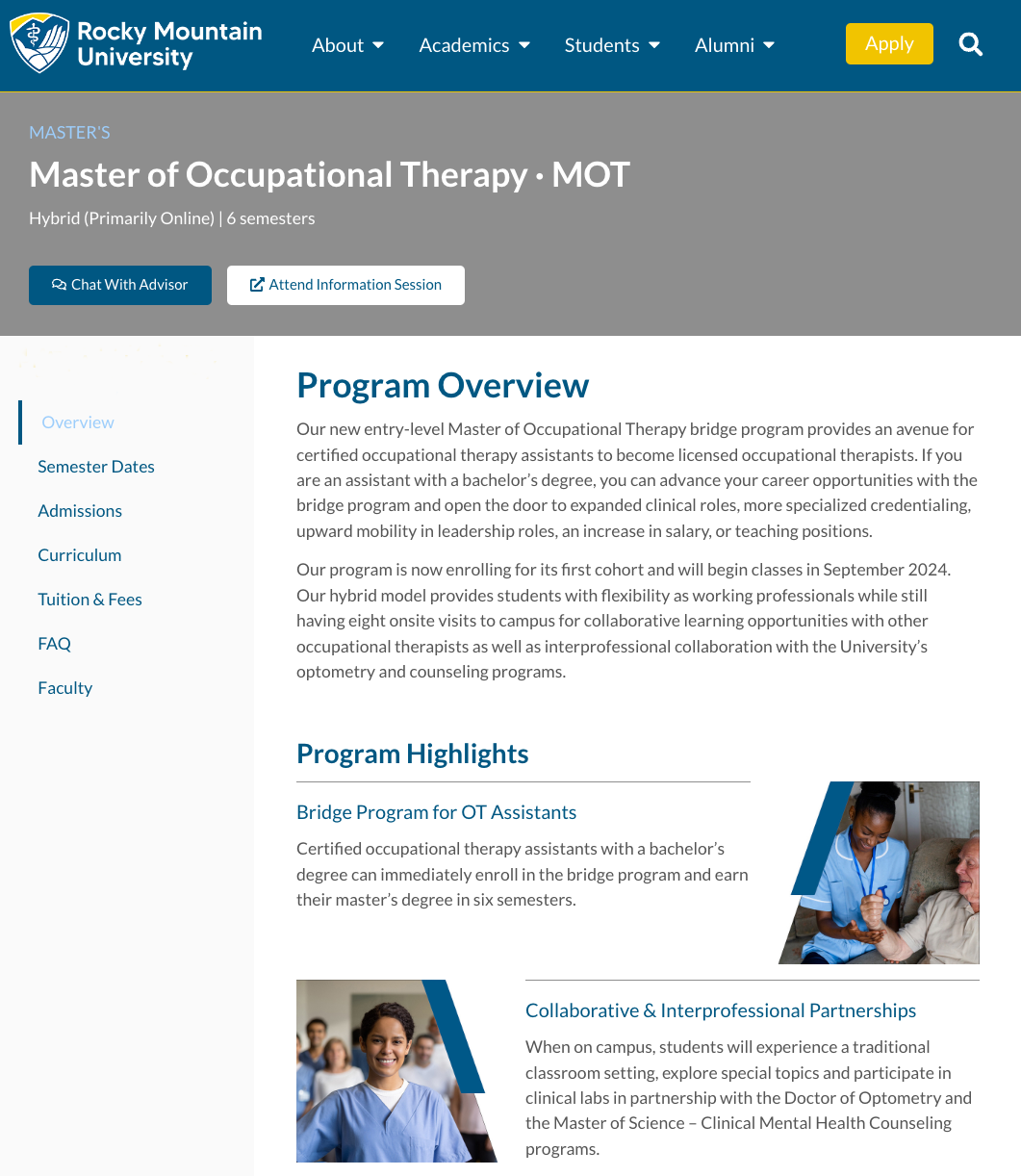
Fig. 14: Side menu for program pages (Desktop)
Within each section of the website which contains a plethora of information to wrangle I used progressive disclosure methods to compartmentalize the information in smaller bits. In Fig. 15 for the curriculum of each program I utilized tabs with accordions. This allows the user to methodically weed through the information at their own pace.
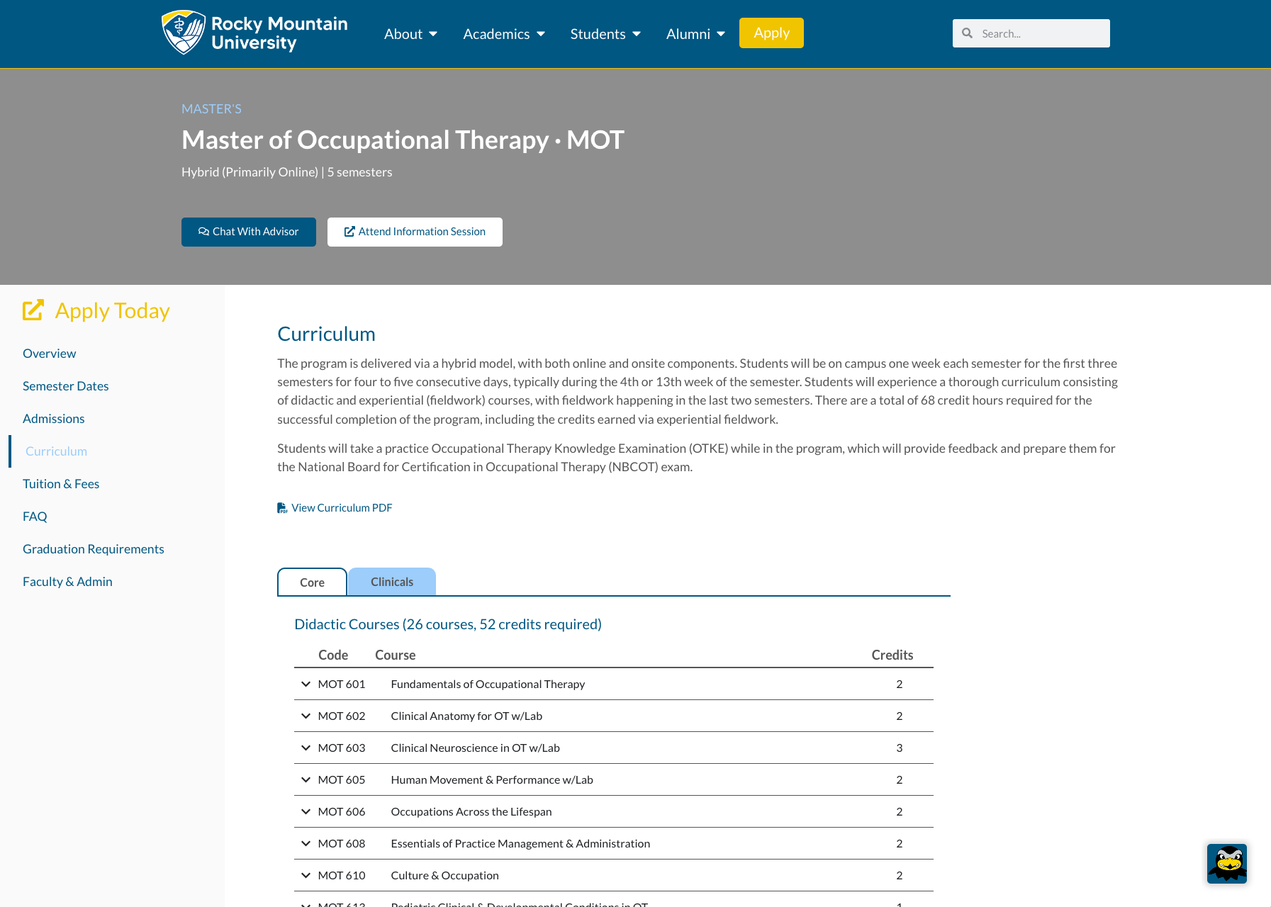
Fig. 15: Side menu for program page/curriculum (Desktop)
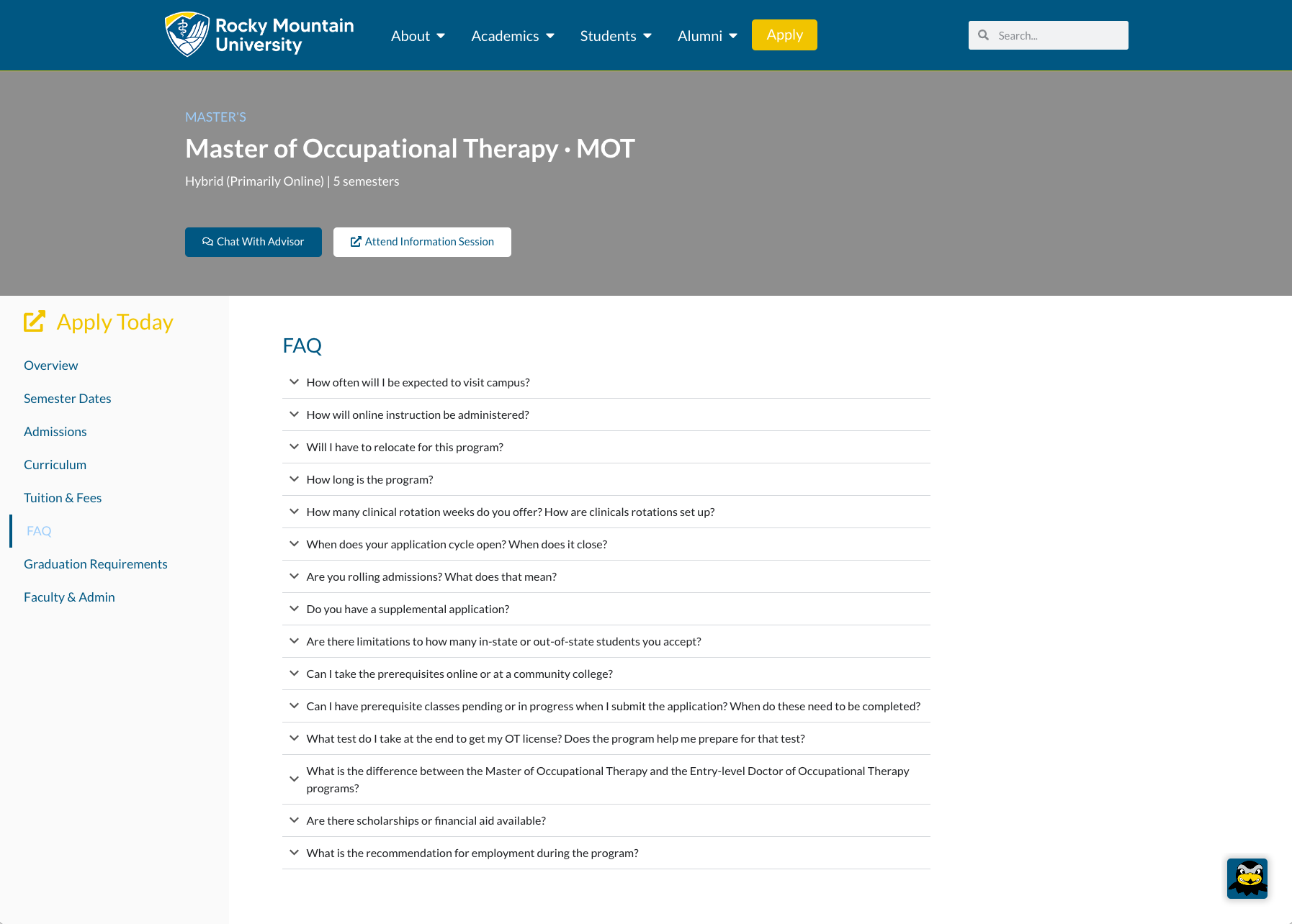
Fig. 16: Side menu for program page/FAQ (Desktop)
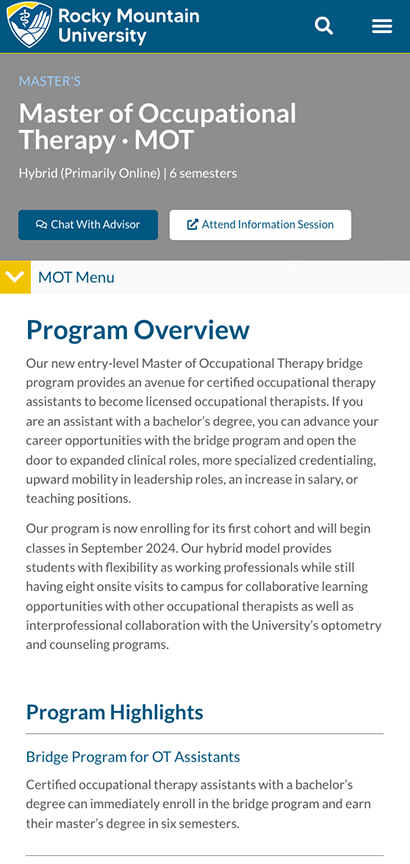
Fig. 17: Program menu (Mobile)
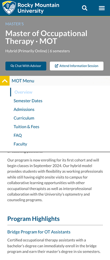
Fig. 18: Program menu expanded (Mobile)
The footer (Fig. 19, 20) is now listed in much more organized manner with categories which reflects the mega menu (Fig. 13). In addition, the logo and contact info. are on the left side which is aligned with the header. The social media icons are now in the footer, which in the previous version were hidden in the right side menu. This makes these icons more visible and accessible to the user.
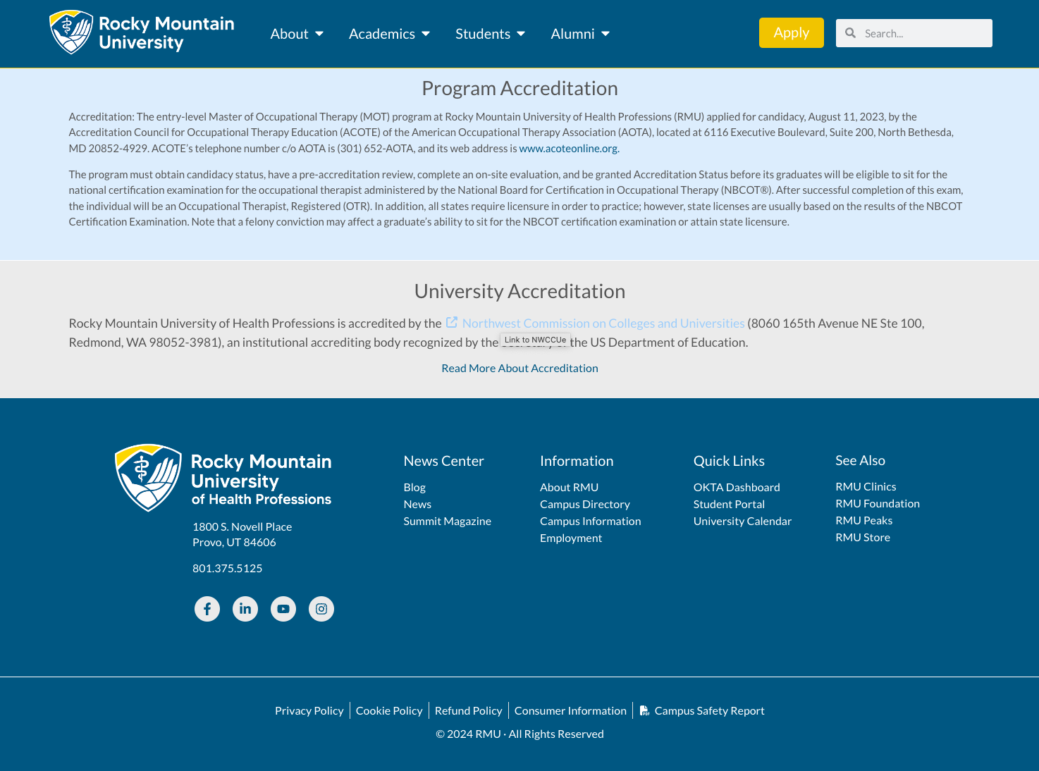
Fig. 19: Footer

Fig. 20: Footer (Detail)
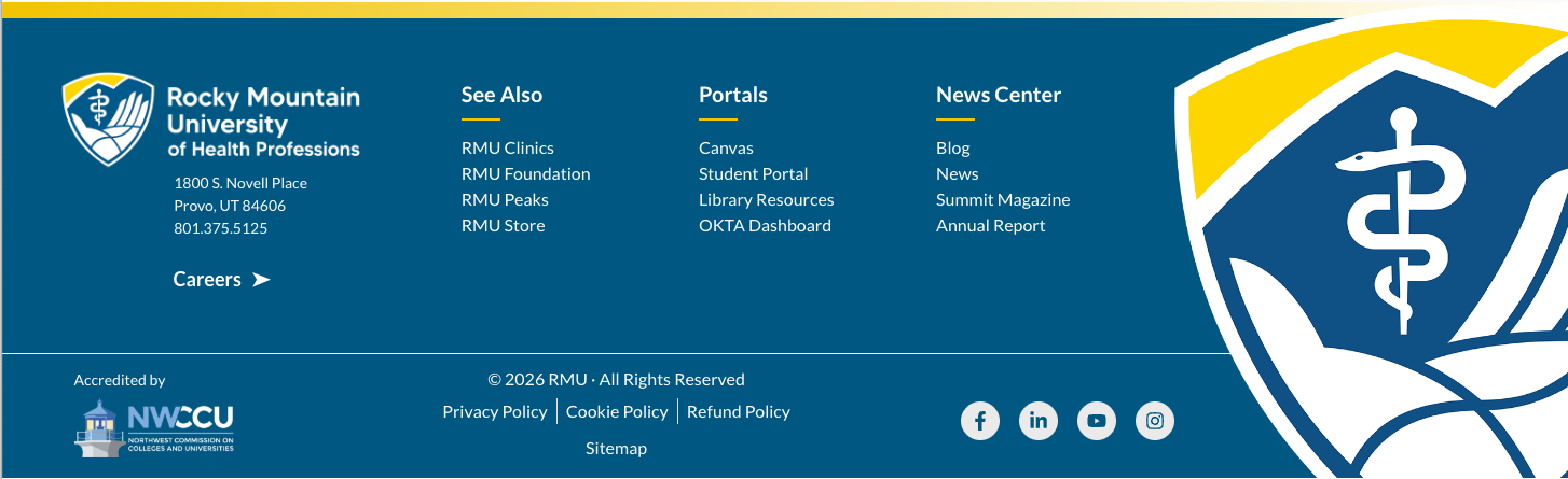
Fig. 21: New Footer
Special Cases
Error/404
I was tasked with creating the new error page for the website. As you can see in Fig. 21 some of the ideas I had for this page, which seemed more verbose than I used in the final design seen in Fig. 22. Another decision that I made was to let the number "404" replace any icon I wanted to use in my sketches.
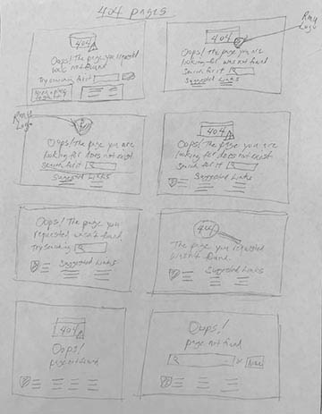
Fig. 21: Sketches of ideas for a 404 page

Fig. 22: 404 page (Desktop)
Discover more examples of work I have done with RMU in another case study.

